Do you wish for conditional formatting in Google Data Studio just like you see in Excel or Google Sheets? Being a marketer, it is always helpful to have a dashboard where you can compare actual results against targets with indicators.
Before we dive into the specifics of conditional formatting in the Google Data Studio, let’s take a look at the basics behind conditional formatting.
What is Conditional Formatting?
Conditional formatting is used to evaluate a pull of a data field against one or more format rules that you set. When you trigger the rule, the table will quickly show you what has changed from the data. Rules tell the platform where to apply a condition.
If you are working in a spreadsheet-like Excel, You have to use a selector for data conditional formatting. If you use data within a program like JavaScript or R, you need to insert regular expressions – shorthand that filters data or a function. But, whatever the format, you will have the authority to control what rule – or even a series of rules – is applied.
Conditional Formatting in Google Data Studio
Conditional formatting allows you to highlight rows and cells of data based on the value of the cell. You can compare a single field in the chart to a literal value (for example, Project Campaign = Holiday Sale), or to another field (Actual Traffic < Forecast Traffic).
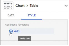
When you add the Connection, you can see the Conditional Formatting section at the top. Click the (+) Add selection and also define the format rules, color and style to apply when the format rules are met. The conditional formatting is set when you click “Save”. Keep in mind Google will only highlight tables and scorecards when you walk through the way to add the conditional formatting point.
Conditional formatting is available within 3 charts:
- Scorecards
- Tables
- Pivot Tables
5 Tips to Use Conditional Formatting in Google Data Studio Reporting
A common theme for creating conditional formatting within Google Data Studio is to showcase your pacing to goals or targets. While you can always use Line or Bar Chart, it’s always helpful if you can put everything within a comprehensive report from a single slide or Executive Summary.
1.Select a Chart
Create a new chart or you can select an existing chart in your report. Conditional formatting is currently supported in scorecards, tables, and scorecards.
2.Add a rule
Go to the Style panel of the chart, and click on “Add” under Conditional Formatting.

3.Configure the Rule
- You can choose Color Type for your chart. There is a color gradient that can be applied to a column to show best to worst just like Excel/Google Sheets.
- Go to the “Format Rules”, and select a field or select “Value”. This will apply to all the values in the chart. For your selected scorecard, this setting will default to “Values” and apply to the selected scorecard metric.
- You have to select the operator and enter the comparison value. This option will define how the definite field will be compared to the value entered. If you are opting for a table, you can select another field for comparison of your data. Go to the dropdown menu and select the Input Value box.
- When the condition is true, select the style changes accordingly. You can always change the text color or background color for the row, field, or any matching value.

4.Save your rule
You have to click on the “Save” button when you are done with configuring the rule.
5.Create Additional Rules
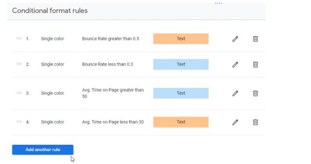
As of now, you can create up to 10 formatting rules per chart. You can drag a rule up and down in the list to reorder your ruleset. Note that rules are always evaluated in descending order, so a rule further down the list will take priority over an earlier rule if the same conditions are matched in the table.

When do you use conditional formatting in Google Data Studio?
Now that you know how to use conditional formatting, here are a few scenarios where conditional formatting can be useful to enhance your dashboard and reports.
Define key segments:
You can highlight significant campaigns, channels, or other key segments of your website traffic
Product category:
You can group a bunch of products of interest in a common color
Performance against a target:
You can use specific colors to distinguish performance above or below the target.
Final thoughts
Conditional formatting in Google Data Studio helps to evaluate performance quickly and efficiently. Create formatting rules on your Google Data Studio scorecards and show your teammates whether or not you hit your goals.
Learn more about Google Data Studio’s best practices, and don’t forget to share your experience with Google Data Studio.
Related Resources


